
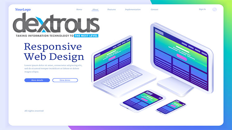
Responsive Web Design: Adapting to the Mobile Era for Enhanced User Engagement
Introduction: In today's mobile era, where smartphones and tablets have become an integral part of our daily lives, responsive web design has emerged as a necessity for businesses seeking to engage and captivate their online audience. With users accessing websites on a wide range of devices, it is crucial to create a seamless and user-friendly experience across different screen sizes. In this blog, we will explore the significance of responsive web design in adapting to the mobile era and discuss how it enhances user engagement.
-
Understanding Responsive Web Design: Responsive web design is an approach that ensures a website's layout and content adapt dynamically to fit the screen size and orientation of the device being used. It involves designing and coding websites in a flexible and fluid manner, allowing for optimal viewing and interaction experiences on smartphones, tablets, and desktops.
-
Catering to Mobile Users: Mobile devices have revolutionized the way people access the internet. With a significant portion of web traffic originating from mobile devices, it is essential to prioritize the mobile user experience. Responsive web design enables businesses to cater to mobile users by providing a user-friendly interface, intuitive navigation, and streamlined content presentation.
-
Consistency Across Devices: One of the primary advantages of responsive web design is the ability to maintain consistency across devices. Whether users access a website on their smartphone during their commute or switch to a desktop computer at work, a responsive design ensures a consistent brand experience, visual identity, and messaging. Consistency builds trust and familiarity, leading to enhanced user engagement.
-
Improved User Experience: Responsive web design significantly improves the user experience by eliminating the need for zooming, scrolling, or resizing content on different devices. By automatically adjusting the layout and content to fit the screen, users can navigate seamlessly, read text comfortably, and interact with elements without frustration. A positive user experience encourages longer visit durations, increased page views, and higher conversion rates.
-
Mobile-First Design Approach: To truly excel in the mobile era, adopting a mobile-first design approach is crucial. This strategy involves prioritizing the mobile experience during the design and development process. By focusing on essential elements, simplified navigation, and fast-loading content for mobile users, businesses can ensure a superior experience that translates seamlessly to larger screens.
-
Faster Loading Speed: Speed is of the essence in the mobile era. Responsive web design promotes faster loading times, as it optimizes content delivery for different devices. By utilizing techniques such as image compression, browser caching, and efficient coding practices, responsive websites load quickly on mobile networks, reducing bounce rates and improving user engagement.
-
Search Engine Friendliness: Responsive web design aligns with search engine optimization (SEO) best practices. Google, for example, prioritizes mobile-friendly websites in search rankings. By having a responsive website, businesses can enhance their visibility in search engine results and attract more organic traffic. Increased visibility leads to higher user engagement and conversion opportunities.
-
Adaptability to Future Devices: As technology evolves, new devices with varying screen sizes and resolutions will emerge. Responsive web design ensures that websites can adapt to future devices seamlessly. Rather than investing in separate designs for each new device, a responsive approach future-proofs websites, providing flexibility and compatibility for upcoming technological advancements.
-
Streamlined Maintenance: Managing multiple versions of a website for different devices can be time-consuming and challenging. Responsive web design simplifies maintenance efforts by eliminating the need for separate updates and changes. Businesses can focus on a single responsive website, making updates more efficient and ensuring consistent user experiences across devices.
-
Data-Driven Optimization: Responsive web design enables businesses to gather valuable user data and make data-driven decisions to optimize the user experience further. By analyzing user behavior, tracking conversions, and conducting A/B testing,
.jpg)


0 Comments:
Leave a Reply